 Labels communicate not only the contents, brand, and particulars of your product, but they also set the tone, expectations, and impressions with which you want your customer to view your product. We like to say, “The label is the only point-of-purchase advertising material that consistently makes it to the shelf.” Try as you may, signs, tags, and other trade dress are often absent at the point-of-purchase. And that is the only place where your customer, your product, their money, and their decision, all come together. So why not make the very best use of your label?
There are practical aspects of label design that are absolutely required. These prerequisites, when missing, can actually stop sales. Since we continue to see them missing in the marketplace, let’s review the necessities first:
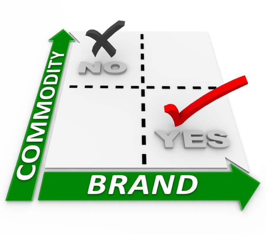
- Product Identification. Often the designers are so carried away with the colors, font, and branding, that the customer is left scratching her head, wondering what’s inside the package. When she’s looking for a particular commodity, she will consistently choose the label that shows that commodity big and bold, sometimes even bigger than the brand name.
- Readability. Some designers are trying to create a work of art rather than a selling tool. You can help mitigate this by choosing fonts that can easily be read from four feet away, which is where she’s pushing her cart. Resist the urge to use a font that has many curlicues or is too abstract. Choose a color pattern that pops out in the fray of all the other competing labels. Don’t let your label be the reason why your product was overlooked.
- Essentials. Some labels force you to look at the back label to discover the essentials, like size, volume, servings, applications, etc. This puts those labels at a disadvantage against other more informative labels. The idea that you can create mystery on a label and make the customer pick it up to solve the mystery is just not true. If it’s too much trouble or she’s in a hurry, she’ll grab another brand.
Only when you have these basics covered do you have the luxury to send a more sophisticated message with your label design. Some of these messages help you communicate your brand’s overall impression:
- Time Period. Do you want the customer to think your brand has been around for a long time; that its well established? If so, you may choose a retro look. If you want to communicate value or status, then you may choose a clean, classic look. Do you want your customers to discover the latest thing? Then you may choose an eye-catching modern look.
- Endorsement. Do you want to show the customer a medal, award or even a quote from a celebrity? Try to get it on the label, or as we did, make a separate label that is visible above or near the front label. You have limited space, so your endorsement must not deter from the basic label information described above.
- Color. Many designers feel that they have a lot of freedom here. But the fact is, most retail stores are lit by blue-cast florescent or LED lighting which may not show true colors. Also, the distance away from the shopper (at least 4 feet) and the surrounding “pizza” of competing labels pretty much demands the use of advancing colors to get the shoppers’ attention.
It’s not easy to get noticed in the first place. It’s a travesty if your brand is there, but can’t be found. Label designs may look cool on your monitor. Your friends, colleagues, and family may love them. But would you rather make statement …or a deposit?